
Wednesday, 7 April 2010


Monday, 5 April 2010
Unit G324 Evaluation
Unit G324 Evaluation
In what ways does your media product use, develop or challenge forms and conventions of real media product?
How effective is the combination of your main product with ancillary texts?
In my group’s music video, we wanted to stick to the generic blueprint of a love song for an alternative rock band, but with a twist that challenges the usual stereotype. Our video uses the theme of loss, as our character wanders around his local area, remembering the times he spent with the woman he loved.
"Helena" By My Chemical Romance
We decided to make our audience feel sympathetic towards our character, Ben. We did this by using a lot of close up shots of his face, which lets the audience see he’s heartbroken. The band My Chemical Romance often uses the theme of loss or death in their videos, and will use extreme close ups of facial expressions to exemplify their emotions. However, this band would be classed as punk rock, and thus use this theme in a much darker and more direct way, by showing such imagery as corpses dancing around their coffins. As our chosen band is much more mainstream, and almost romantic, we wanted ours to be subtle and sweet, showing how our character misses his partner, and placing beautiful flowers on her grave.
We know that a lot of our audience, (both genders, aged 15-25, ) will have experienced death in their lives, and we wanted to use our video to create a relationship and bond between our character and our audience; this means that they will relate to the video and see the beauty and romance involved, referencing Lacan’s Theory of identity. We also used costume from popular brands across Britain, such as Top Shop, which will show the audience that our character is similar to them, so that they can relate to him further.

We wanted to avoid making our female character look amazingly beautiful. We did not want the audience to feel voyeuristic, therefore subverting the Male Gaze theory. We did this because the average person isn’t as perfect as many music videos portray, and our audience know this. We wanted the audience to believe it and relate to it more. We also thought that if we were to include voyeuristic shots, it wouldn’t suit the theme and feel of the video.
Our character is 18 years old, but has been forced to deal with a very serious scenario. We wanted to show that the youth of today can cope with adult issues, and deal with them in their own way, representing them as mature and strong.
My digipak challenges the stereotype for an alternative rock band. I have used some quite strong, almost shocking images, which could seem too imposing, and maybe more suited to a heavier rock, or punk rock band.
Each panel of my CD includes the theme of mouths. I used this theme as it links to the song title, “The Kind Of Thing You’d Say”. I have used very similar images of a shouting face throughout the digipak, to link it to my theme, and to make it interesting and powerful enough to be the album of a rock artist. Teeth can be perfect for framing words and letters, and the mouth itself has so many interesting features, such as a tongue, which can be used as a base for text or images, so to me it seemed that this theme would work perfectly for an album.
I wanted my digipak to stand out from other CDs, such as “Playboys” by The Rasmus, and, “A Fever You Can’t Sweat Out”, by Panic! At The Disco: two albums with quite boring images or dull colours, both of which don’t stand out. I wanted mine to use interesting images, such as Fall Out Boy’s “Infinity On High” or “Captain Morgan’s Revenge” by Alestorm. It uses the silhouettes of the band members in the centre of the front image, as many debut albums do, to promote the actual band members and increase their own individual popularity. The silhouettes I’ve used reference Green Day’s “International Superhits!” with the use of fading the band into the rest of the image, as seen in All American Rejects’ “Move Along”.
This will appeal to my target audience, males aged 16-25, because it is striking and interesting, with reviews from media products such as HMV and Kerrang! which are popular to the demographic.

My promotional poster
The advert uses a similar image to my digipak, drawing attention once again to the mouth but showing more of the face around it, shouting advertising text. This references an album by Franz Ferdinand, which is based on an old WW2 propaganda poster. These have an attractive woman calling out. I wanted this to be even more imposing and striking than the CD, as I wanted it to look like it was almost forcing you to buy the album. By turning the head to face the front it looks like you’re being shouted at, and the words stand out more in bold format.
Ghost Silhouettes idea
Sunset Grave idea
What have you learned from your audience feedback?
My audience feedback taught me that I don’t have to stick too firmly to the stereotypical thoughts of what an alternative rock bands album should look like. Using social networking sites such as Facebook and Bebo, I asked 10 males and 10 females, aged between 16 and 20, a variety of questions about my ideas, such as, “If you saw this for sale, would it attract you enough to want to buy it?”.
I began with the idea of having either the shadow of a grave surrounded by flowers, in front of a romantic sunset, or the silhouette of a man holding the hand of a woman, who’s fading out into the background. The feedback collectively gave similar results, all basically saying that these wouldn’t be interesting enough to grab attention and they don’t promote the band enough. This I completely agree with, but didn’t notice at the time, so these reactions really helped to push me towards my final product.
After posting my final ideas and panels I got a variety of responses, but they all seemed positive. The males I asked said things like, “I love it!” and “I’d buy that, it looks professional!” whereas some of the females replied that it was scary, but effective. This shows that the males I asked generally found the image more effective, and it appealed to them more than the women, who thought it worked technically, but didn’t necessarily like it enough to buy it. I didn’t think that it would appeal as much to a female audience, as the image is quite strong and masculine; I would expect females to prefer a more illustrative, rather than graphic, image.
In the audience feedback for our Music Video, we used Facebook to send out another Questionnaire. This included questions such as, “How would you say a male is generally represented in a music video?” They replied with “Manly”, “Strong”, “A leader”, and “The best in a group.” However, we decided to keep our male character as an average person, who lives in similar situations to our audience, so that they can relate to him. The results that came back generally backed up our main points, and meant that we didn’t have to change much.
How did you use media technologies in the construction and research, planning and evaluation stages?
The use of my media blog was incredibly useful to the construction of my work. Having my tutors give me constructive feedback at every stage of my work and development meant that I could see where I was going wrong, and how I could improve it. The “Edit” part of the blog meant that I could easily go over the areas that weren’t as strong, and build on them to achieve a higher grade. This blog allowed us to put any work, development or related article onto a space where anyone could access it, and add to it, from wherever they were, be it at home, at school or anywhere with a computer. This meant that I could access my feedback at any time. The blogs allowed us to not only write in the standard area, but also to embed videos from Youtube or Google Videos, post ‘Google Documents’ for formats such as Microsoft Powerpoint files (which can’t run straight from the blog), or hyperlink other URLs.
In our music video, we decided to use Adobe Premiere, an advanced editing programme; this enables us to neatly edit clips together, use a video transition between shots and easily view the editing as it develops. We used some of these transition effects for shots such as when our character sees his lost partner, and she vanishes before our eyes. This was a ‘Ghosting’ effect added to a change in opacity. This meant that the shot showed the image of the last few frames, as it progressed, giving it a ghost-like quality. We used a Sony Handicam Digital Camcorder to shoot our music video. This was lightweight, easy to use and can connect to our computers instantly.
In my digipak, I decided to use Adobe Photoshop, a programme I’ve grown up with and thus know very well. This allowed me to create, import and manipulate any images stored on a computer, a USB stick or the internet; to add, change and tweak any aspect necessary. It also incorporates a variety of different filter effects, to make an image look more interesting and stylised. I often used a filter effect called ‘Cut-out’ with ‘Lens Flare’ to make the image look two dimensional, and almost cartoon like, and to give it an interesting lighting effect, which looks like the lighting used on a stage. To take my images I used my Fujifilm FinePix 4800z Digital Camera, which I know well, is light enough to easily carry, has a good focus and resolution and can get the images onto my computer just by putting in a camera card.
In my research to find an unsigned band, I used Myspace, a social networking site which also has a section for promoting British bands. It lets you see a page showing all the information about a band, how many fans they have on the site (and what they think of the band), some publicity pictures and some of their inspirations and views. Once I found a band I was interested in, I used Youtube, (a video hosting site, where you can search for any of millions of videos across the world), to look at the band and find out more about them. These sites allowed me to quickly access information and listen to the music of the band.
A lot of my inspiration for making our music video came from watching the Kerrang! Channel on my Skybox TV. This channel broadcasts a variety of new, classic, top rated videos and the Top 40 of the month, from all areas within the rock genre. This allowed me to see a variety of different bands and videos, to see which ones related to our ideas, analyse them and use some of the ideas or techniques in our own work.
Jack Edwards
ROUGH Unit G324 Evaluation using Google Docs to Upload
Here is my ROUGH evaulation, this time using Google Docs to upload it, to show all the images used. This version has grammatical and spelling mistakes.
Unit G324 Evaluation
In what ways does your media product use, develop or challenge forms and conventions of real media product?
With, How effective is the combination of your main product with ancillary texts?
In my groups music video, we wanted to stick to the generic blueprint, for an alternative rock band, of a love song, but with a twist that challenges the usual stereotype. Our video uses the theme of loss, as our character wanders around his local area, remembering the times he spent with the woman he loved.
We decided to make our audience feel sympathetic towards our character, Ben. We did this by using a lot of close up shots on his face, which lets the audience see he’s heartbroken. The band My Chemical Romance often uses the theme of loss or death in their videos, and will use extreme close up’s of facial expressions to exemplify their emotions. Although, this band would be classed as punk rock, and thus use this theme in a much darker and more in your face way, by showing such imagery as corpses dancing around their coffins. As our chosen band is much more mainstream, and almost romantic, we wanted ours to be subtle and sweet, showing how our character misses his partner, and placing beautiful flowers on her grave.
We know that a lot of our audience, both genders ages 15-25, will have experienced death in their lives, and we wanted to use our video to create a relationship and bond between our character and our audience, this means that they will relate to the video and see the beauty and romance involved, and referencing Lacan’s Theory of identity. We also used costume from popular brands across Britain, such as Top Shop, which will show the audience that our character is similar to them, so that they can relate to him further.
We wanted to stay away from making our female character look amazingly beautiful, and giving the audience a sense of voyeurism, and thus subverting the Male Gaze theory. We did this because the average person isn’t as perfect as many music videos portray, and our audience know this. We did this so that the audience will believe it and relate to it more. We also thought that if we were to include voyeuristic shots, it wouldn’t suit the theme and feel of the video.
Our character is 18 years old, but has been forced to deal with a very serious scenario. We did this to show that the youth of today can cope with adult issues, and deal with them in their own way, representing them as mature and strong.
My digipak challenges the stereotype for an alternative rock band. I have used some quite strong, almost shocking images, which could nearly seem too imposing, and maybe suitable for a heavier rock, or punk rock band.
Each panel of my CD includes the theme of mouths. I used this theme as it link to the song title, “The Kind Of Thing You’d Say”. I have used very similar images of a shouting face throughout the digipak, to link it to my theme, and to make it interesting and powerful enough to be the album of a rock artist. Teeth can be perfect for framing words and letters, and the mouth itself has so many interesting features, such as a tongue, which can be used as a base for text or images, so to me it seemed that this theme would work perfectly for an album.
I wanted my digipak to stand out from other CDs, such as, “Playboys” by The Rasmus, and, “A Fever You Can’t Sweat Out”, by Panic! At The Disco; two albums with quite boring images or dull colours, both of which don’t stand out. I wanted mine to use interesting images, such as Fall Out Boys, “Infinity On High” or “Captain Morgan’s Revenge” by Alestorm. It uses the silhouettes of the band members, in the centre of the front image, as many debut albums do, to promote the actual band members and increase their own individual popularity. The silhouettes I’ve used reference Green Day’s, “International Superhits!” With the use of fading the band into the rest of the image, as seen in All American Rejects’, “Move Along”.
This will appeal to my target audience, Males aged 16-25, because its striking and interesting, with reviews from media products such as HMV and Kerrang! Which are popular to the demographic.
The advert for my digipak uses a similar image to my digipak, it shows more of the face around the mouth, shouting advertising text. This references an album by Franz Ferdinand, which references an old WW2 propaganda poster. These have an attractive woman calling out. I wanted this to be even more imposing and striking than the CD, as I wanted it to look like it was almost forcing you to buy the album. I did this by making it look like you’re being shouted at, and by having the words in bold, to stand out more.
What have you learned from your audience feedback?
My audience feedback taught me that I don’t have to stick too firmly to the stereotypical thoughts of what an alternative rock bands album should look like. Using social networking sites such as Facebook and Bebo, I asked 10 males and 10 females, aged between 16 and 20, a variety of questions about my ideas, such as, “If you saw this for sale, would it attract you enough to want to buy it?”.
I began with the idea of having either the shadow of a grave surrounded by flowers, in front of a romantic sunset, or the silhouette of a man, holding the hand of a woman, who’s fading out into the background. The feedback collectively gave similar results, all basically saying that these wouldn’t be interesting enough to grab attention and they don’t promote the band enough. This I completely agree with, but didn’t notice at the time, so these reactions really helped to push me towards my final product.
After posting my final ideas and panels I got a variety of responses, but they all seemed positive. The males I asked said things like, “I love it!” and “I’d buy that, it looks professional!” Whereas some of the females replied with, “Its scary, but effective” This shows that the males I asked generally found the image more effective, and it appealed to them more than the women, who thought it was technically effective, but don’t necessarily like it enough to buy it. This reaction I didn’t expect, but I understand, I didn’t think that it would appeal as much to a female audience, as many of them generally don’t like as striking or imposing images.
In the audience feedback for our Music Video, we used Facebook to send out another Questionnaire. This included questions such as, “How would you say a male is generally represented in a music video?” They replied with “Manly, strong, a leader, the best in a group” We decided to keep our male character as an average person, who lives in similar situations to our audience, so that they can relate to him. The results that came back generally backed up our main points, and didn’t mean that we had to change much.
How did you use media technologies in the construction and research, planning and evaluation stages?
The use of my media blog was incredibly useful to the construction of my work. Having my tutors give me constructive feedback at every stage of my work and development meant that I could see where I was going wrong, what I could do about it and the “Edit” part of the blog meant that I could easily go over the areas that weren’t as strong, and build on them to achieve a higher grade. This blog allowed us to put any work, development or related article onto a space where anyone can access it, and add to it, from wherever they were, be it at home, at school or anywhere with a computer. This meant that wherever you were, you could work and see what feedback you have. The blogs allowed us to not only write in the standard area, but it allows us to embed videos from Youtube or Google Videos, post ‘Google Documents’ for formats such as Microsoft Powerpoint files, which can’t run straight dfrom the blog, or hyperlink other URL’s, for easy point making, examples, or work in other formats.
In our music video, we decided to use Adobe Premiere, an advanced editing programme, made to neatly edit clips together, use a video transition between shots and easily view what you’re editing as it develops. We used some of these transition effects for shots such as when our character see’s his lost partner, and she vanishes before our eyes. This was a ghosting effect added to a change in opacity. This meant that the shot showed the image of the last few frames, as it progressed, giving it a ghost like quality. We used a Sony Handicam Digital Camcorder to shoot our music video. This was lightweight, easy to use and can connect to our computers instantly.
In my digipak, I decided to use Adobe Photoshop, a programme I’ve grown up with and thus know very well. This allows you to create, import and manipulate any images stored on a computer, a USB stick or the internet, to add, change and tweak any aspect that you need to. It also incorporates a variety of different filter effects, to make an image look more interesting and stylised. I often used a filter effect called Cut-out with Lens Flare’s to make the image look two dimensional, and almost cartoon like, and to give it an interesting lighting effect, which looks like the lighting used on a stage. To take my images I used my Fujifilm FinePix 4800z Digital Camera, which I know well, is light enough to easily carry, has a good focus and resolution and can get the images onto my computer just by putting in a camera card.
In my research to finding an unsigned band, I used Myspace, a social networking site which also has a section for promoting British bands. It lets you see a page showing all the information about a band, how many fans they have on the site, and what they think of the band, some pictures of them and some of their inspirations and views. Once I found a band I was interested in, I used Youtube, a video hosting site, where you can search for any of millions of videos across the world, which I used to look at the band and find out more about them. These sites allowed me to quickly access information and listen to the music of the band.
A lot of my inspiration for making our music video came from watching the Kerrang! Channel on my Skybox TV. This channel broadcasts a variety of new, classic, top rated videos and the Top 40 of the month, from all areas within the rock genre. This allowed me to see a variety of different bands and videos, to see which ones related to our ideas, analyse them and use some of the ideas or techniques in our own work.
Jack Edwards
I sent a questionnaire to 10 males and 10 females on the website Facebook (as it is easily accessible and easy to respond to surveys with), to find out some things about the audience I wanted to target for my music video.
The questionnaire was as follows:
1. Male/Female?
2. How old are you?
[ 0-16 / 17-26 / 27-36 / 37- 46 / 46+]
3. Where do you buy most of your clothes?
(Topshop / Primark / Black Lace etc)
4. Why do you buy your clothes here?
5. Where do you buy your music?
(HMV / Itunes / Download etc)
6. Why do you buy your music here?
7. How often do you listen to your music?
8. How do you listen to your music?
(iPod / Itunes / WMP / Walkman / Spotify / Mp3 / Cds etc)
9. How do you think the female in a couple is represented in a typical music video?
10. How do you think the male in a couple is represented in a typical music video?
I aimed to keep the questions short and only ask a few, so that my target audience would actually answer the questions, however i had to ask strong questions so as to gather in depth analysis.
The first two questions, tackling gender and age, were to establish our audience demographic and made it so i could distinguish between the different male/female views in the other questions.
Question 3 - 8 were used to find out where my target audience like to shop for clothes and music, and how they like to listen to their music. The aim of this was so i could utilise some of their favourite clothing brands and styles and music technology (e.g iPods) within my music video. I asked where they buy their music and why as a lead on for when i make my digipak and magazine advertisement, to see where they would find the music, so i could create a digipak that would be suitable for particular outlets.
Question 9 and 10 were questions directly involved with my music video. The main two characters of my music video are a couple, and so i wanted to find out how my audience felt they are represented in a music video. However this only gave me negative feedback about how each gender was represented (e.g promiscuous and cheap), so i could have improved this question by asking how my audience thought they should be represented, or by having my audience listen to the track before answering the questions, so they answer the question based on the alternative rock genre of music, as it seems the responses i got were related to the R'n'B and rap genres. I created this table on Edexcel from the research i collated.
It was difficult to separate the qualitative and the quantitive data in the questions i'd asked, so i used 'Opinions' columns to show the qualititive data.
To present the quantitive data i created a sub-title of the particular issue (For instance under Clothes Shopping i had Discounted Stores/Charity Shops, Highstreet stores and Online). I used these particular titles as these were the main groups my audience responded with. I then wrote the number of people that had answered with a particular preference under each sub-title. To present the qualititive data that i had also recieved as responses to these questions, i created a new row entitled 'Opinions', and here i wrote the main recurring reasons my audience had said why they chose that particular answer (For instance the audience who had answered in the HighStreet group said they shopped there as it was reliable and stylish.)
 On Seven Story Down's Myspace page, they have a total of 237 fans. This is a mixture of other, similar unsigned bands (like the Zom Zoms) and older and younger fans. The majority of the fan base are of the younger generation, 17-26 year olds. They are all musically expressive (from looking at their profiles) and are fans of the alternative rock genre, supporting other bands such as Muse, Kids in Glass Houses and Funeral For a Friend. The fans range from areas all around the world, some are from Seattle and some are from Kent, where the band themselves are from.
 This is a screen shot of Seven Story Down's Facebook page. It shows the same age and location range of fans. Most of the fans on this page are fans that have seen Seven Story Down playing live in local bars and clubs, supporting other, bigger acts. This is a technique used to promote bands all around the country, even with already signed bands. It helps to introduce the band to a fanbase and helps them to become signed.
Seven Story Down use their Facebook page to interact with fans, they advertise their new tracks on it with the music player, they post status updates advertising these new tracks and also gigs they are playing. The fans themselves use the Facebook page to upload photos they have taken themselves of Seven Story Down playing live gigs, and they can interact with other fans from across the world. The fans leave comments of appreciation and encouragment to the band.
Sunday, 14 March 2010
Album covers that inspired my digipack include:
Green Day: International Superhits I liked the bold image of the band in the center, with wording at the top and bottom. This strongly influenced my digipack as i wanted something bold, interesting, and that would stand out from other albums. All American Rejects: Move Along I loved the way the band faded into the background, it made them seem like part of the album instead of just being on the cover.
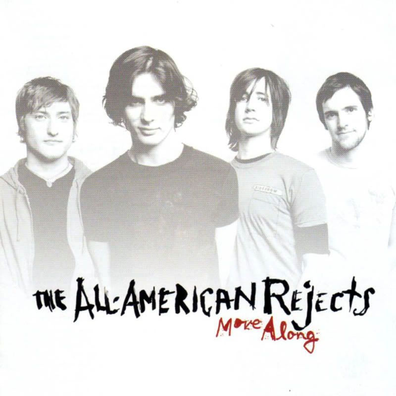
Green Day: International Superhits I liked the bold image of the band in the center, with wording at the top and bottom. This strongly influenced my digipack as i wanted something bold, interesting, and that would stand out from other albums.
All American Rejects: Move Along I loved the way the band faded into the background, it made them seem like part of the album instead of just being on the cover.
Unnused inside covers
These are a selection of inside covers I initially wanted to use. They show images of each band members eye and mouth, reflected onto eachother to make a symmetrical image. These came out quite creepy, and wouldn't have worked as backgrounds. This is Ian's, the tones dont blend together well here, but you get the impression of what was intended.
 This is Ben's, who'd have been recognised from the video. His mouth doesnt fit in with the rest of him, I tried not reflecting it here, and it hasnt worked.
 This is my own one. It's by far the best as it all blends in together, and is the most striking image.
 This is Ian's, the tones dont blend together well here, but you get the impression of what was intended.
 This is Ben's, who'd have been recognised from the video. His mouth doesnt fit in with the rest of him, I tried not reflecting it here, and it hasnt worked.
 This is my own one. It's by far the best as it all blends in together, and is the most striking image.
These might have worked better for a heavy metal or punk band again, as they're very "in your face" and striking.
Magazine Advert
This is my final magazine advert. Its very eye catching and appealing. In this i referenced Franz Ferdinand's album, which was influenced by an old German poster, which shows a woman shouting out words, which attracts attention. In my version, instead of using an attractive woman who'll attract attention in an almost sexual way, I used my own, unshaven, unperfect mouth, with subverts expectation, but is still eye catching and interesting. I used colour in this image. This again will draw attention to it, and shows contrast between it and the digipack, even though theres an obvious link between them. 
FINAL Digipack sides
I decided to use the theme of a mouth throughout my final digipack. This was inspired by our artists song, "The Kind Of Thing You'd Say". In each of my panels, I have used similar images of my mouth, but being slightly distorted or different in each panel.
This is my final back cover. I carried on the theme of teeth and mouthes throughout. I wanted each tooth to frame each song title. In this I decided to crop to just the teeth, and rotate it to make obvious seporation between each title. I also enhanced the colour of this, which makes the writing stand out and makes the image more interesting. This is a middle page; most cd packs have one page giving some background information about the artist. In this I show each of the supposed band members, with a hint of a picture. I have used the same cutout effect on each picture, using eyes to contrast with the mouth theme. This picture started off as black and white, but i decided to make it almost sepia tone in places, just to make it more interesting and colourful. In this panel, I decided to crop the picture to only show the right side of the mouth, then mirrored it. This makes an eye catching design, frames the text and draws your eye to the center.

In this panel, I decided to write some fictional reviews, which would attract the audience with possitive reactions from some of their favourite musical names. The design of this panel is used to emphasise the writing, and make it stand out. This panel is dark, which makes the white writing bolder. The background image is a similar picture, but flipped upside down. This makes the image interesting, and makes the viewer look twice, as its subtle, which makes it effective.

This is my front cover. Im very pleased with it. I've included the "gig lights", which give the flash of colour it needs, otherwise it would be an average, dull black and white image. The writing on the teeth is well spaced out, and is readable. The mouth suits the song, and the cover suits the genre, as its interesting, but not over done, it shows the band, and is appealing to its audience.
This is my final back cover. I carried on the theme of teeth and mouthes throughout. I wanted each tooth to frame each song title. In this I decided to crop to just the teeth, and rotate it to make obvious seporation between each title. I also enhanced the colour of this, which makes the writing stand out and makes the image more interesting.
 This is a middle page; most cd packs have one page giving some background information about the artist. In this I show each of the supposed band members, with a hint of a picture. I have used the same cutout effect on each picture, using eyes to contrast with the mouth theme. This picture started off as black and white, but i decided to make it almost sepia tone in places, just to make it more interesting and colourful. In this panel, I decided to crop the picture to only show the right side of the mouth, then mirrored it. This makes an eye catching design, frames the text and draws your eye to the center.
In this panel, I decided to write some fictional reviews, which would attract the audience with possitive reactions from some of their favourite musical names. The design of this panel is used to emphasise the writing, and make it stand out. This panel is dark, which makes the white writing bolder. The background image is a similar picture, but flipped upside down. This makes the image interesting, and makes the viewer look twice, as its subtle, which makes it effective.

This is my front cover. Im very pleased with it. I've included the "gig lights", which give the flash of colour it needs, otherwise it would be an average, dull black and white image. The writing on the teeth is well spaced out, and is readable. The mouth suits the song, and the cover suits the genre, as its interesting, but not over done, it shows the band, and is appealing to its audience.
This version not only had overlapping text, but also the light is coming from the middle persons head, which could seem a little biased or may hide the detail of the band members head. The hint of colour really makes an impact, and makes the image interesting. This is just a simple lense flare effect on Photoshop, but it looks like the lighting you'd get when performing on stage. This version has overlapping text, which makes it look messy and hard to read. Its also completely black and white, which makes the image seem to uninteresting and un eye-catching.

This image was one of the bases of my overall developement of my digipack. I used a cutout effect in Photoshop to make it look like a stylised poster. The feet of the band members in the foreground doesnt work with the colour of the background, as it looks too much like they've been cut out, which makes it look unprofessional and tacky.

 This version has overlapping text, which makes it look messy and hard to read. Its also completely black and white, which makes the image seem to uninteresting and un eye-catching.
This image was one of the bases of my overall developement of my digipack. I used a cutout effect in Photoshop to make it look like a stylised poster. The feet of the band members in the foreground doesnt work with the colour of the background, as it looks too much like they've been cut out, which makes it look unprofessional and tacky.


Wednesday, 20 January 2010
Idea for Digipack cover
Here is one of my initial ideas for my digipack cover. I need to find a better fitting font for the album name at the bottom, as its not easy to read and blends in with the image too much. This idea will appeal to our target audience, 15-24 y/o males, as its an interesting and new design, which catches your eye. This was made using images i found on the internet, so i will have to re make it with my own.

Tuesday, 5 January 2010

Music video analysis
Muse Hysteria - Music Video Analysis
Muse are one of the most successful current rock bands in the world, whose songs have won many awards including The NME Award, Kerrang! Award and MTV Award, all very honourable achievements. They’ve currently released 3 chart topping albums, and Hysteria is one of my favourite songs of theirs, because it has a very catchy tune and is well written and played.
The video starts off with an eye zooming into the screen. This could be your attention drawing to the video, but could also represent you becoming the camera of the video. I see this as the camera is the viewer’s eyes, which in a state of ‘Hysteria’ is watching the band, which ties into the song title.
We see a distorted, unlit view of the band who are about to play, silhouetted in front of a projection screen. Again, the distorted lighting links with the title of the song.
Suddenly the rhythmic music starts, and each beat is synchronised with a new shape on the screen behind them. For the first 20 seconds, all we can see are these quickly appearing blobs, and the distorted silhouettes and highlights of the band and their instruments. We recognise more and more shapes as the music builds. This again is an unnatural, distorted view of the band which almost makes us feel like we’ve gone crazy, as there are so many flashing lights and blobs, we don’t know what to look at.
As the main chords are played by the lead guitar, we see a ripple effect that shakes as the chord bends. The ripples then form the rings of speakers, which pulsate with the heavier chords, this is clever imagery which’s dream like quality keeps to the distorted theme.
As the vocals start, the camera flickers and shakes, with a collection of short, fast shots of the band flashing on the screen. The images of speakers start to turn like a record as the singer says, “twisting me around”. Then light moving images form on the screen, which twist and shape into different things, giving the impression of turning inside out, as said in the lyrics. As the song bursts into the chorus, with a surge of instruments and iconic lyrics, the singer raises his arm and cloud shapes rush towards the camera. This emphasises the power of the song, and almost makes us jump. As the singer says, “lose control” a surge of what looks like red blood cells are pumped through instead of the clouds, which could be the effect of losing control kicking in to someone in a state of hysteria.
We see images of nerves, water, lightning and stars flashing and moving around the band, which again gives a distorted and surreal edge to the video, making you feel like you’re hysterical and that the band is dream like.
Then for the first time, a blood red colour flows down behind and below the band, as the music builds again for the last chorus, which makes us see them in a different way; it makes them look more menacing and gothic, which relates to the genre. The red forms generic gothic images like graveyards and dark eyes, with the band member’s head banging and holding up their guitars, in the instrumental.
It finally zooms out to the same eye, at the end, as the song and hysteria is over.
This song has a sort of narrative structure in the way that it shows you what they may seem like in a hysteric state, and it shows its viewer going into and falling out of this state, at the two ends of the song. The images on the screen behind them relate to the lyrics that are being said, if you were in this sort of state, you would hear people saying words but see distorted images and not what’s really there.
Monday, 4 January 2010
My music video analysis
Im having trouble with getting word files on here, i'll talk to Mr Seal about it when we're back.
My music video analysis was of Muse: "Hysteria"
My music video analysis was of Muse: "Hysteria"
Subscribe to:
Posts (Atom)
